Understanding Color Psychology in UI Design
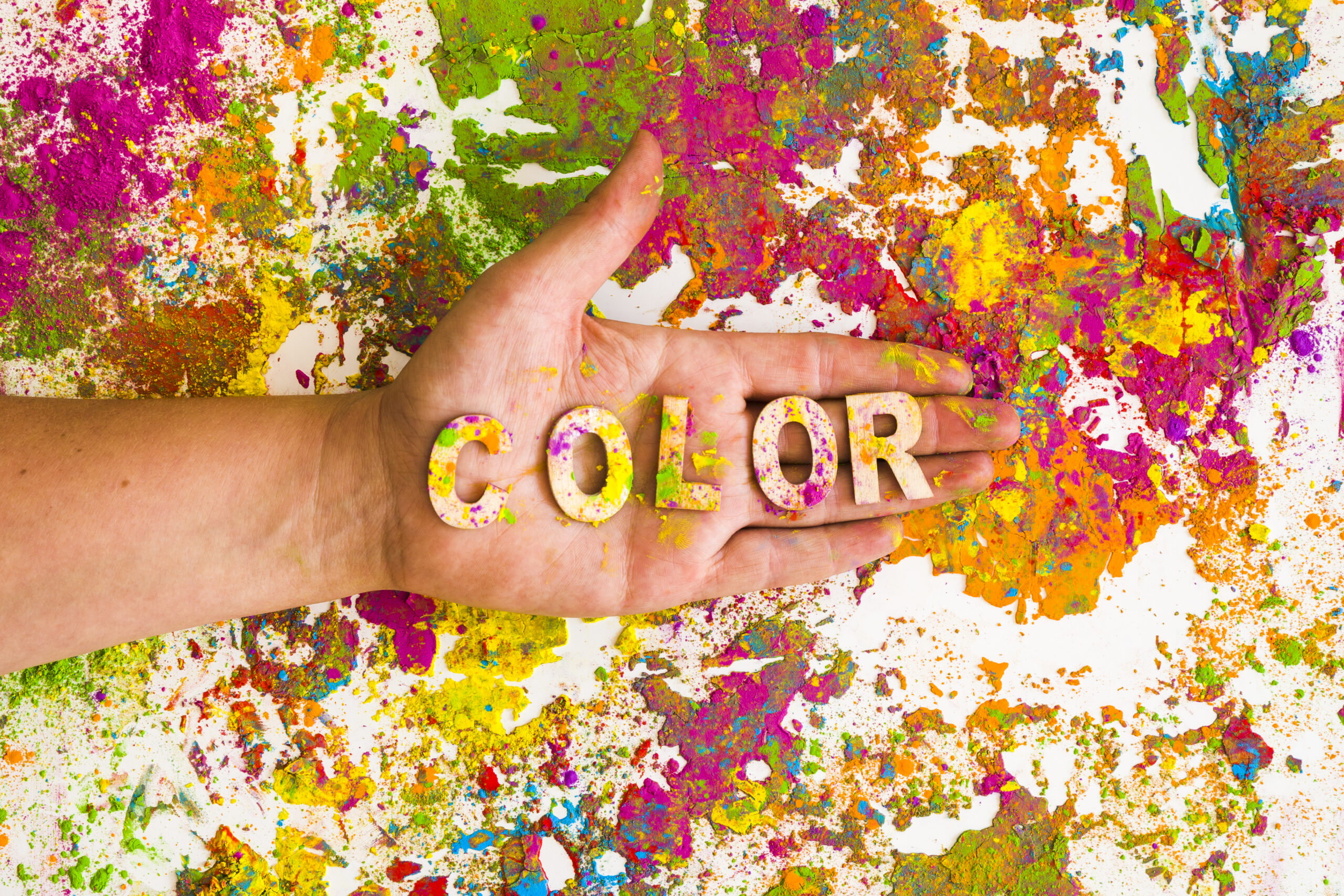
In the realm of UI design, color psychology plays a crucial role in influencing user behavior and emotions. By leveraging color theory, UI designers can enhance the overall experience of a website or mobile application. This comprehensive guide delves into the fundamentals of color psychology, its impact on user perceptions, and practical tips for selecting cohesive color palettes in UI design.
The Basics of Color Theory
Color theory is a framework that helps UI designers understand how colors interact and influence users. It encompasses several key terms and concepts that serve as the foundation for effective color application in UI design.
Hues
Hues are the pure colors of the spectrum, such as red, blue, and yellow. They form the basis for creating other colors through combinations and modifications.
Tints and Shades
Tints are lighter versions of hues, created by adding white to a color. They are often used for backgrounds, overlays, or elements that require a subtle visual presence. Shades, on the other hand, are darker versions of hues, produced by adding black to a color.

Tints
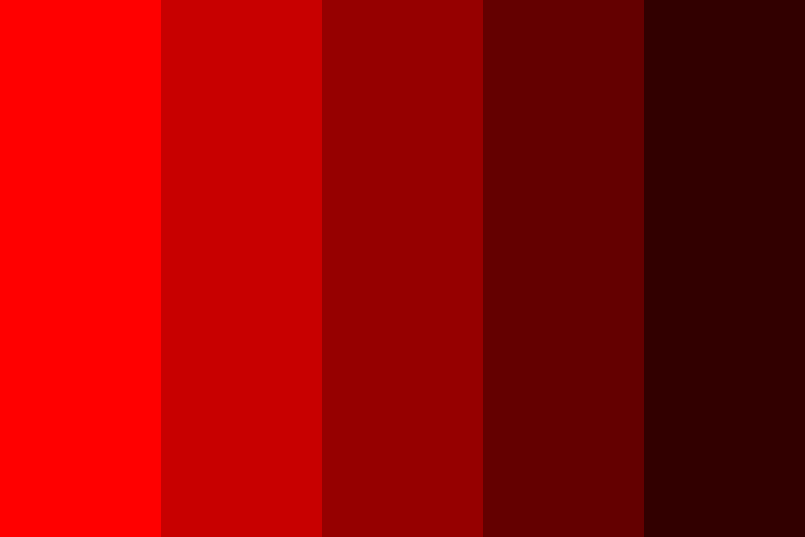
Shades
Saturation
Saturation refers to the intensity of a color, or the amount of gray it contains. Highly saturated colors are eye-catching and can be used to draw users’ attention to crucial UI components, while desaturated or muted colors create a more subdued and sophisticated aesthetic.
Color Psychology: How Colors Influence User Behavior and Emotions
Color psychology is the study of how colors impact human behavior, emotions, and moods. It explores how different colors affect our perceptions, attitudes, and actions. While the meanings and associations of colors can vary across cultures and individuals, certain colors are commonly linked to specific emotions or qualities.
Blue: Tranquility, Trust, and Relaxation
Blue is frequently associated with feelings of calmness, trust, and relaxation. It’s a popular choice for tech companies, social media platforms, financial institutions, and healthcare or wellness-related apps and websites, as it conveys a sense of security and stability.
Red: Passion, Energy, and Urgency
Red is often linked to emotions of passion, energy, and urgency. As a powerful color that demands attention, red is commonly used for warning messages, error notifications, and sale promotions. It can also evoke feelings of love and romance, making it an ideal choice for dating apps and websites.
Green: Growth, Harmony, and Nature
Green is typically connected to notions of growth, harmony, and nature. Often used in sustainability and environmental websites, as well as financial apps, green conveys a sense of balance and tranquility.
Purple: Luxury, Creativity, and Spirituality
Purple is frequently associated with luxury, creativity, and spirituality. Commonly used in fashion and beauty websites, as well as creative and artistic platforms, purple conveys a sense of elegance and refinement.
Orange: Energy, Enthusiasm, and Warmth
Orange is often used in designs that aim to evoke a sense of playfulness and friendliness. It can incite feelings of joy, creativity, and innovation, making it a popular choice for entertainment and social media platforms.
Yellow: Positivity, Optimism, and Happiness
Yellow is typically associated with positivity, optimism, and happiness. Often employed in branding and designs related to children or sunshine, yellow can bring brightness and warmth to a design. However, excessive use or improper implementation may cause eye strain or visual fatigue.
Brown: Earthiness, Stability, and Warmth
Brown is frequently used in designs related to nature, outdoor activities, and organic products. It conveys a sense of grounding and authenticity, as well as tradition, due to its connection to natural materials like wood and leather.
Grey: Neutrality, Balance, and Sophistication
Grey is often employed as a background or base color in UI design, as it allows other elements to stand out while providing a clean and modern aesthetic. It can convey a sense of professionalism, reliability, and even technology and innovation.
Black: Elegance, Sophistication, and Power
Black is commonly used to convey a sense of luxury and exclusivity. It’s frequently seen in high-end brands and designs where a sleek and minimalist aesthetic is desired. Black can also create a sense of mystery and intrigue but should be balanced with white space and complementary colors to avoid a gloomy atmosphere.
Pink: Femininity, Playfulness, and Sweetness
Pink is often used in designs targeting a predominantly female audience or those focused on products and services related to beauty, fashion, or romance. It evokes feelings of nurturing, compassion, and warmth, although its interpretation can vary across cultures and contexts.
White: Simplicity, Cleanliness, and Purity
White is commonly used as a background color in UI design, as it allows other elements to stand out and provides a clean, minimalist aesthetic. It conveys a sense of professionalism, efficiency, and modernity, while also giving a sense of spaciousness and trustworthiness. Balancing white with other colors is essential to avoid a sterile or bland appearance.
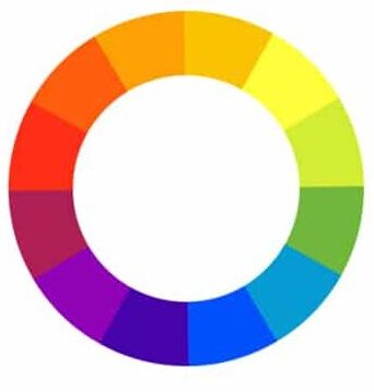
The Color Wheel: A Fundamental Tool for UI Designers
The color wheel is an essential tool for understanding and exploring color relationships in UI design. It consists of a circular arrangement of hues that visually demonstrates how colors interact and can be harmoniously combined.
Analogous Colors
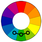
Analogous colors are those adjacent to each other on the color wheel, sharing similar undertones and creating a sense of unity. This approach promotes a balanced and familiar user experience.
Complementary Colors
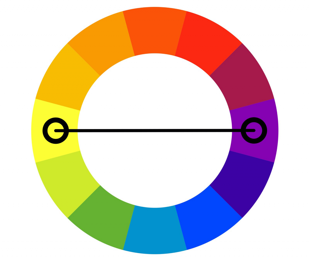
Complementary colors are located opposite each other on the color wheel, offering a striking contrast when paired together. This contrast helps highlight important information or interactive elements, improving overall usability.
Split Complementary Colors
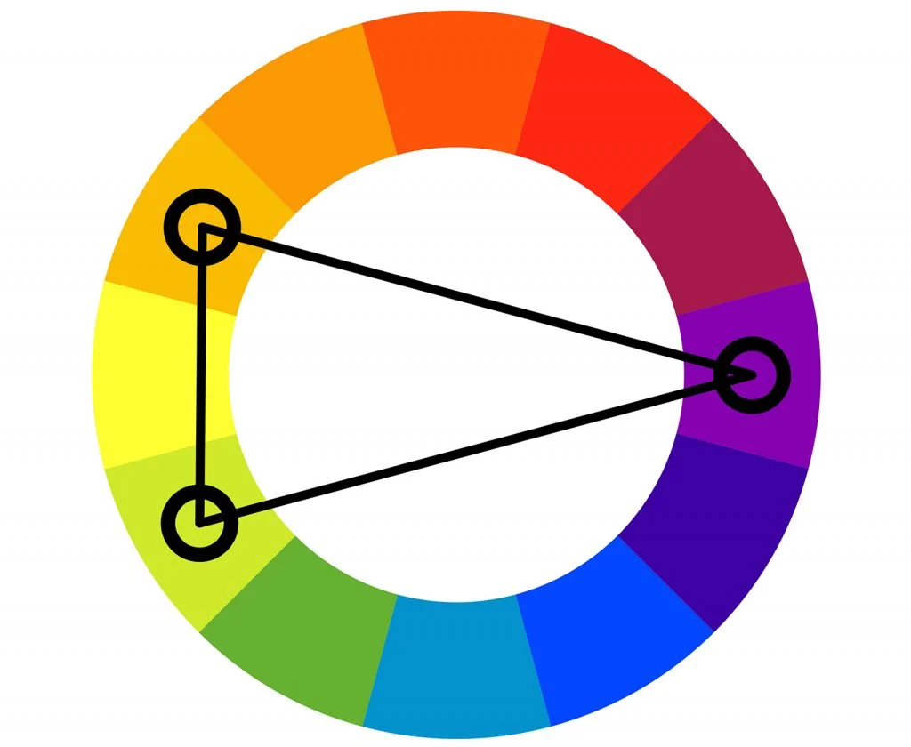
Split complementary colors involve choosing a base color and pairing it with the two colors adjacent to its complementary color. This scheme combines contrasting colors while maintaining cohesion, making it effective for highlighting specific UI elements.
Triadic Colors
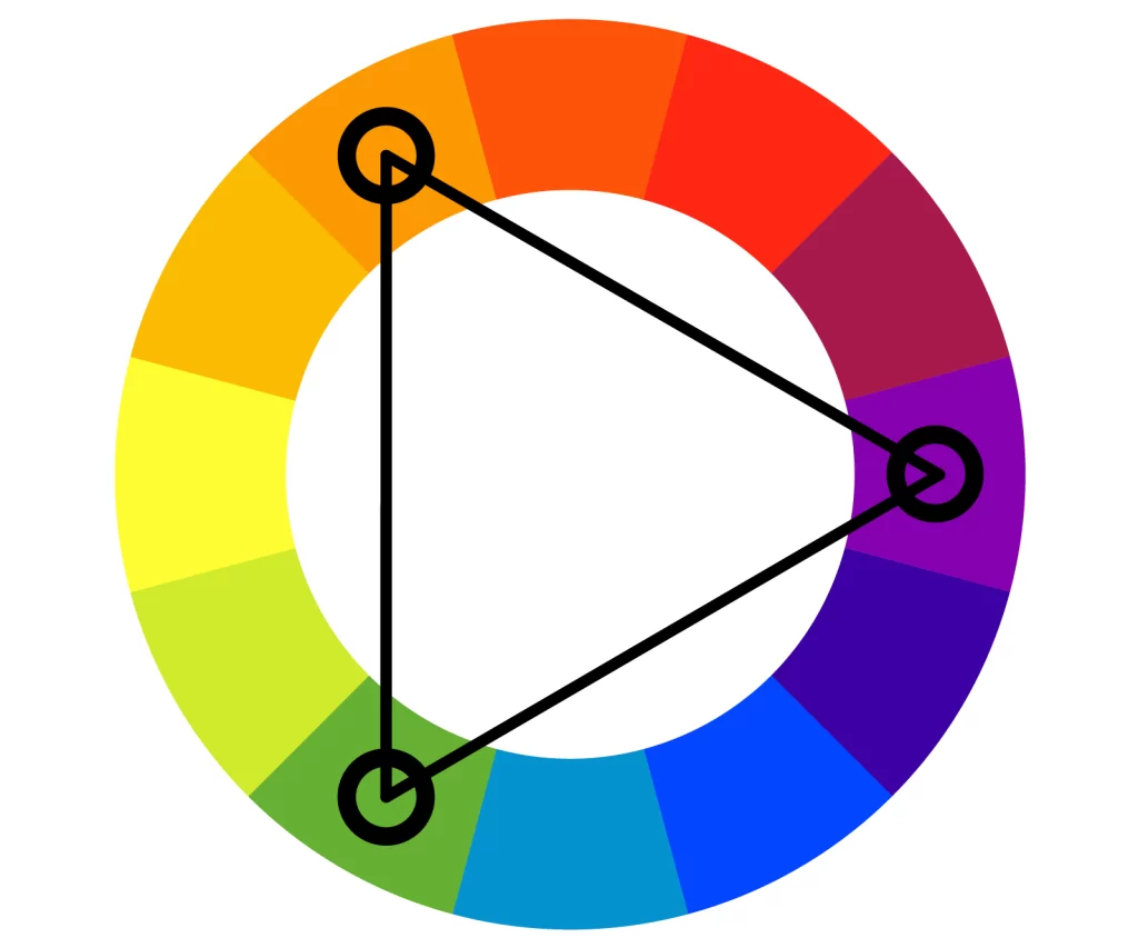
The triadic color scheme in UI design involves selecting three colors evenly spaced on the color wheel, such as primary or secondary colors. When used effectively, this scheme can bring visual interest and excitement to the UI without overwhelming the user.
Square Colors
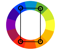
The square color scheme involves choosing two sets of complementary colors evenly spaced on the color wheel, creating a square or rectangle shape. This approach allows for a wide range of color combinations but requires careful balance and hierarchy to avoid overwhelming the user.
Conclusion
Incorporating color psychology and color theory into UI design can significantly impact user perceptions and decision-making. By understanding the principles of color and applying them strategically, UI designers can create harmonious, balanced, and effective designs that enhance the overall user experience.
- 210 views
- 0 Comment